

Web Design Company in Raleigh, NC
Raleigh Web Design
Websites designed and hand-built in Raleigh, NC: fast, accessible, built to rank, and easy for your team to update.
Web Design in Raleigh, Built to Perform
City of Oaks Marketing is a Raleigh, North Carolina web design company. We design and build custom WordPress websites for businesses in Raleigh, Durham, Cary, Chapel Hill, and across the Triangle, and for clients around the country who want the same thing: a site that looks like their brand, loads fast on a phone, ranks for the searches that matter, and can be updated without calling a developer.
What makes us different from most Raleigh web design agencies is that the people who design your site are the people who build it. There is no handoff from a design shop to a development shop, no page builder, and no template with your logo dropped in. Every site is a hand-coded WordPress theme with performance, accessibility, and search built in from the first template. That is why the Hoppr rebuild launched at a 94 performance score, and why TBG Homes saw 200% organic traffic growth in the five months after launch.

What Our Raleigh Web Design Services Include
Every project is scoped to the business, but these are the pieces that go into nearly every website we design.
Custom Website Design
A visual system designed for your brand and your customers, not adapted from a theme marketplace. Layout, typography, color, imagery, and motion decided on purpose, and shown to you in context before anything is built.
Brand Identity
Logo, color, type, voice, and guidelines for businesses whose brand needs work before the website can express it. Our brand identity design services and the website can be one project or two.
Responsive, Mobile-First Design
Designed for the smallest screen first and scaled up, so the site is genuinely good on a phone rather than shrunk to fit. Read more about our responsive web design in Raleigh below.
Conversion-Focused UX
Navigation, page structure, forms, and calls to action designed around the decision your visitor is making, with analytics set up so you can see what converts and improve it.
Built as a Custom Theme
Every design is built by our own Raleigh web development team as a hand-coded WordPress theme: no page builders, structured fields for editing, and integrations with the tools your business runs on.
SEO and AI Search Built In
Semantic HTML, structured data, fast Core Web Vitals, and page architecture mapped to real searches, so the site ranks and gets cited by AI assistants from launch. Our Raleigh SEO services carry it forward after launch.
Designed for Raleigh and the Triangle
Being a local web design company means you can meet the person building your site, and it means we know the market you sell into. We have designed and built websites for Triangle businesses across very different industries: the Law Offices of James Scott Farrin, one of the largest personal injury firms in North Carolina, headquartered in Durham; The Trust Company of North Carolina and Sumus, a wealth management firm and a business advisory firm, both in Cary; and Fidelity Bank, a community bank with 56 locations across 25 North Carolina counties at the time of launch. Before founding City of Oaks Marketing, our founder built websites at Go Fish Digital, a Raleigh agency, which is where several of those relationships began.
Local also means practical things: meetings in person when you want them, a phone number that reaches the person doing the work, and a team that has already solved the problems Raleigh businesses bring us, from multi-location service companies to firms competing in the Triangle’s crowded professional-services market.
Responsive Web Design in Raleigh
Every site we design is responsive by default: one site that adapts its layout, typography, and navigation to phones, tablets, laptops, and desktops, with no separate mobile site and no degraded experience. It is not a line item we add. It is the foundation every build starts from, because more than half of your visitors arrive on a phone, Google indexes the mobile version of your site first, and Core Web Vitals are measured primarily on mobile.
In practice that means we design for the smallest screen first and expand from there, use fluid typography and spacing so text reads well at every size, size buttons and navigation for fingers rather than cursors, and hand-code every breakpoint instead of inheriting a page builder’s bloat. We target green Core Web Vitals on mobile and desktop from the start of development, not as a post-launch fix, and every build is tested on real devices and browsers before launch. Clean, semantic, mobile-rendered HTML is also what AI crawlers read, so a site that is good on a phone is a site AI systems can parse and cite.
Already have a site that breaks on mobile? Sometimes it can be retrofitted; often a targeted rebuild is faster and cleaner, and we will tell you which during discovery. Our page speed optimization and ADA website compliance services share the same code-level approach.

What Sets Our Web Design Apart
The things clients tell us they could not get from the last agency.
No page builders, ever
Elementor, Divi, and their peers ship many times the code a page needs and put a ceiling on speed and search. We hand-code every theme, which is how our sites stay fast as they grow.
You own everything
The code, the design files, the content, the analytics, the domain. No platform fees, no lock-in, and nothing that makes changing agencies harder than it should be.
Design and search are one project
Keyword mapping and page architecture happen before design starts, so the site is designed around how customers actually search rather than retrofitted for SEO afterward.
Editors get structured fields
Your team updates the site through clearly labeled fields, not a maze of nested blocks. Swapping a testimonial, adding a location, or launching a landing page is a marketing task, not a developer ticket.
Accessible by default
WCAG contrast, keyboard navigation, and semantic structure are part of the design system, not a retrofit. See our ADA website compliance service for regulated industries.
Fixed price, no surprises
Projects are scoped after a discovery call and quoted as a fixed price. Our website cost guide explains what drives the price of a custom WordPress build before you ever talk to us.
Recent Web Design Work
A software company, a home builder, a bank, and an agtech catalog, each on a custom design and a hand-coded WordPress theme.
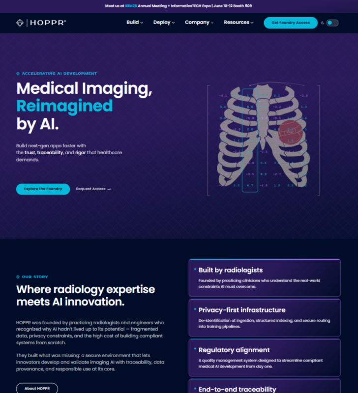
HOPPR
How we rebuilt Hoppr.ai from Squarespace to custom WordPress: performance from 42 to 94, SEO score from 77 to 100, and Core Web Vitals passing outright.
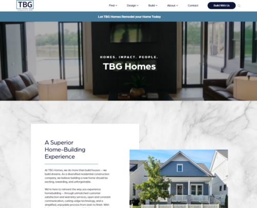
TBG Homes
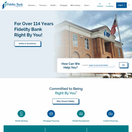
Fidelity Bank
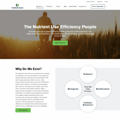
Verdesian Life Sciences
How a Web Design Project Works
Discovery and strategy.
We learn the business, the audience, and what the website has to do, audit the current site and its rankings, and map the pages and keywords the new site needs. Output: a written brief and a fixed quote.
Design.
Wireframes, then full designs for every template, shown at phone and desktop sizes and in your real content, with structured feedback rounds so decisions happen quickly.
Build and migrate.
A hand-coded WordPress theme with performance, accessibility, and structured data built in, content migrated, every existing URL redirected, and your team trained on the editor.
Launch and grow.
Daily monitoring through launch week, Search Console and analytics baselines recorded, and an optional care plan or SEO engagement so the site keeps improving.
Web Design Company in Raleigh, NC
City of Oaks Marketing is based in Raleigh, North Carolina and serves Raleigh, Durham, Cary, Chapel Hill, Apex, Wake Forest, and the rest of the Triangle, along with clients nationwide. Call 919-200-0201 or book a discovery call to talk through your project. Design is half of what we do: our Raleigh web development team handles custom themes, WooCommerce, API integrations, and migrations, and our web design and branding overview shows how the pieces fit together.
Raleigh Web Design Questions, Answered
How much does web design cost in Raleigh?
It depends on the number of page templates, the amount of custom design, the integrations the site needs, and whether the project includes a migration or a brand refresh. Most custom WordPress websites we design and build fall in the $10,000 to $30,000 range; a focused site for a small business sits at the lower end and a multi-location or ecommerce build at the upper end. We quote a fixed price after a discovery call, and our website cost guide walks through what moves the number.
How long does a website design project take?
It depends on the size of the site and how quickly decisions can be made on your side. Discovery and design are usually the longest phases, because that is where the important choices happen; the build itself moves quickly once designs are approved. We give a schedule with the fixed quote after discovery, and we structure feedback rounds so a small group of decision-makers can keep the project moving.
Do you only work with businesses in Raleigh?
No. We are based in Raleigh and work with many Triangle businesses in Durham, Cary, Chapel Hill, and Wake Forest, but our clients also include law firms, banks, home builders, and software companies in Missouri, Florida, and other states. Most projects run remotely with regular video calls; local clients are welcome to meet in person.
Do you use WordPress templates or page builders?
Neither. Every site is a custom design built as a hand-coded WordPress theme. Templates and page builders are faster to launch, but they ship far more code than a page needs, limit performance and SEO, and make sites harder to secure. Several of our case studies, including Hoppr (from Squarespace) and Dragonboat (from Elementor), are rebuilds that replaced a template or builder with a custom theme, with the before-and-after numbers included.
Will my new website rank in Google?
A new site is designed to be able to rank: keyword mapping and page architecture happen before design, and every template launches with semantic HTML, structured data, fast Core Web Vitals, and clean internal linking. Where a site ends up depends on competition and the authority the domain has earned, which is why many clients continue with our Raleigh SEO services after launch. We will tell you what is realistic for your market during discovery rather than promise rankings.
Can we update the website ourselves after launch?
Yes, and that is one of the main reasons we build the way we do. Every section is driven by clearly labeled structured fields, so your team can change copy, swap images, add team members or locations, publish articles, and build landing pages without a developer. We train your editors at launch, and our WordPress care plans handle hosting, updates, and security if you would rather not.
Does responsive design affect my search rankings?
Directly, yes. With Google’s mobile-first indexing, the mobile version of your site is what Google evaluates for rankings. Responsive design that adapts fluidly to any screen size is a baseline SEO requirement in 2026, not an enhancement.
Can you redesign an existing site to make it responsive without rebuilding everything?
Sometimes, yes. We audit your current site first to understand what’s working, what’s causing responsiveness issues, and what SEO equity is worth preserving. If the existing codebase or theme is the problem, a targeted rebuild is usually faster and cleaner than retrofitting. We’ll be direct about which approach makes sense for your situation.
Ready for a website that works as hard as you do?
A 30-minute discovery call is enough for us to tell you what is holding your current site back and what a custom design and build would mean for your traffic and leads. No obligation.